Creative CV

CVdone

I wanted to make my CV personal to me yet still have a strong element of professionalism to it. Throughout my final ear I seem to have had a running theme throughout my sketchbooks with include details similar to the boarder on this CV. I thought this would be a nice way to introduce myself, with a little colour and pattern that represent something continuous about myself and my work. I spoke to Amelia and Dan Peterson about how I should go about creating the boarder, as I wasn’t sure how drawing it up before opening it in photoshop would work out, however Dan told me it was possible if I scanned in my image at 600dpi and made sure the background was completely white and remove and dirt spots. I then did the rest on photoshop. My photoshop skills are not great I will admit that it took a lot of playing around with to figure out which tool does which job, but it was quite a fun process. I tried to keep the colours simple and to a colour scheme which again is one that has seemed to crop up throughout my work in this final year. I have also published my CV on my website.

Professional Practice: Business Cards

Another part of professional practice is to design our business cards for the upcoming degree show and most likely afterwards. Something fantastic about having Dan P as a tutor is that he gets things done and he knows his people. Each year Dan P uses the same printer for the business cards and we get them done all together. By doing this, it will make the overall cost cheaper. Dan P was extremely helpful with the designing process of the cards, and we were going to get an indesign workshop planned but we ended up being short on time with the Bristol exhibition looming. Dan offered to give us a helping hand for the people who struggle to use programs such as indesign, and simply asked us to send him some photographs or scans of our works that we wanted on our cards, and he left the rest to himself! Some people were savvy enough to be able to put something together themselves, however I was not one of these people. This year we were asked to get them done a little earlier than usual due to the Bristol exhibition, so everyone had to do this earlier in order the get them printed together. I sent my designs of to Dan and he sent back what he had put together and they were lovely!

Here’s the designs that Dan sent me back, and I replied instantly explaining how happy I was with the results. I checked all the details were correct and that was that. They took a little longer than we expected to print, and the people who were participating in the first week of the Bristol exhibition had a window of time where they were without their cards at the show, however Dan dropped them off to the gallery. Due to the cards being printed earlier than we expected, I panicked slightly at what I would be including on them. I originally told Dan that I thought I would need 2 different business cards, one for the Bristol exhibition and another for the degree show. This was because the work I decided to show in the Bristol show is completely to the work that I am making for my degree show. I spoke to Dan about this and in the end we decided to have an image of each illustration technique on both sides of the card, making it multi-functional and expressing both areas of illustrating that I am interested in and keen to work in.

Professional Practise: Website Development

Throughout this year we have been working with Dan Peterson. I’ve found it extremely helpful whenever we’ve had the chance to have tutorials with him or if he hosts lectures. We had a range of lectures last year and one of those focussed on the development of our websites. To me this was pretty daunting as I have no idea how to do much online, or even on a computer for that matter, however Dan was helpful with this. We were advised to make a separate page on wordpress and customise it that so it is more tailored to a website rather than a blog. I had heard pretty good things about a few other websites such as Cargo Collective, Weebly, Squarespace and so on, so I decided to give Cargo Collective a try.

There pricing was pretty similar to that of wordpress, around $9 a year to be able to have your own domain name. Eventually, after what seemed to be much more stressful than it maybe should have been, I eventually got my own domain. I decided to go with the name ‘Heather Kirk Illustration’. I already have a facebook page set up that enables people to search the same name and then ‘like’ it, so keeping the same name for my website keeps it continuous and easy to remember. I had a tutorial with Dan shortly after we came back after having our Christmas break, and I spoke to him of how I was struggling to find work I liked and enough work to show on my website and in my portfolio. I spoke to him of how I wasn’t very happy or keen on the work I had produced in my first 2 years studying here, and that it’s only recently in this final year that I have began to develop into the illustrator I do actually want to be. Dan highlighted the importance of only putting work into both the physical portfolio and my online website that I am happy with and also prepared to reproduce. By putting up something that I am not happy with, and then someone comes across my work and gets in touch with me asking for me to create something for them in that style, I will be reluctant to do so and a waste of time for both parties involved. So unfortunately at this moment in time there is not too much going on on my website, as there are only the most recent works that I am happy with. I have struggled to begin to build my physical portfolio for similar reasons, but another tutorial with Dan P tomorrow will sort this out.

When signing up to Cargo Collective I thought it might be easier than I thought, and there were step by step guides on how to set up. To begin with, the site took me through which themes I can use. Once I had set up my payment in order to have my own domain, more themes became available to me. I spent a good few days at first just trying to understand all the different links and tips and tricks and soon enough had to put it down before it drove me completely insane. I left it for a while and then when the Bristol exhibition began to grow closer, I got myself back into action and sorted it out. Our websites then went live on the PAPER Arts website, so anyone that read the event for the show could have clicked onto the website at any point, so I had to make sure it was running well. This also meant that I could have a look at everyone else’s websites to which gave me a much brighter view of how mine should be coming together and the correct information I should be sharing alongside my work.

My original theme seemed to be a good choice at the beginning, and then when I had a tutorial with Dan P and we looked over it together, he helped me to realise that maybe it wasn’t the best design. The title of the opening page, being  Heather Kirk Illustration, was too long to spread out, so the words began to automatically cut themselves up. Along with this, the options for how the thumbnails of my work was to be first presented were slim. This gave overall bad first impressions, and thats what it’s all about right?

Anyway, I am now at a point where I am happy and confident with the appearance of my website, and I am beginning to develop a much better understanding of how on earth you work these things!! Most importantly, getting to grips with the CSS side of my website. I spent an evening just fiddling about with each detail and noting down what each change effected on my website, and then eventually figuring our how I’d like it to look and making the necessary adjustments. To begin with, I had just used the text box and wrote my name in there and had it in black. Basic. When I got to fiddling about with it, I started looking at different fonts (mostly through WORD) and tried out a few different colours, but it just didn’t feel very personal to me… it felt as though it needed a little extra pizazz. I had also been looking at Sarah Edmonds’ website for inspiration and ideas. The heading image on her website is extremely unique to her as an illustrator and I really wanted something like this for myself, but wasn’t too sure how to get it. She also included the image that she uses on her business cards, which I thought was a great idea. I currently don’t have anything like this for myself, I don’t have an illustration that illustrates me.. but maybe this is something to work on (Note To Self). She seems to have produced it digitally also, which is a grey area for me, something to talk with Dan over. Anyway, this inspired me to try and look harder for something that might reflect me as a person until I manage to come up with something a little more interesting for my head image. I remember way back in the day I used to use font generator websites online to achieve something I probably couldn’t get using WORD. I spent a good while looking through all of the fonts that were available to me, and then trying to decide which colour I wanted added a little more time onto that too. But eventually I found a few things that I liked and decided to save them and see what they look like. I tried to find fonts that were rather sketchy, fun and quite natural looking, like handwriting. Here are the ones I picked out first:

blunt.bluntdaisys-delights.medium (1)daisys-delights.medium

I found myself struggling to pull myself away from using pastel yellows and oranges for the colour of the header, as they’re my favourite colours. Besides, I think they work well and represent me too. I use soft colours like these throughout my work, so this seemed fitting. I warmed to these titles but they seemed to be a little too thin and delicate, and the bottom two reminded me too much of my sisters handwriting.. that’s a good reason to dislike something right? So I looked for some more:

hectic.regular (1)hectic.regularhectic.regular (2)

I then found this font and really warmed to it. I really liked the lightheartedness it has about it, its fun and inviting. I thought I should maybe try out a few different colours to see what they’re like on my website (I actually uploaded them, not just as the above). I went for burgundy as it is another one of my favourite colours and another colour that crops up rather frequently in my work, however when I tried it on my website it seemed over powering of my work and just didn’t seem to fit. So I went back to mustard yellow. I really liked this and felt as though it worked well and was what I was trying to go for. I then tried to add a little extra detail. Something that has been consistent throughout my sketchbook, just little details when decorating titles or making a page just a little more exciting is adding little flicks of colour with coloured pencils. So I thought i’d try and get this onto the font. I don’t have any of the adobe software (YET) so I tried to find something I could download through my app store or use online, just something simple like Microsoft Paint so that I could add those tiny details of colour, however this happened.. not quite to plan..

Header1header3

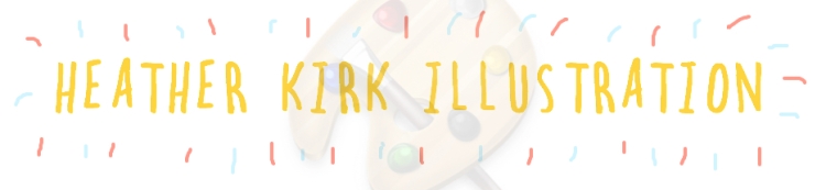
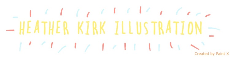
As you can see by the above images that what I had hoped to achieve has been tainted by tagging. I tired out two different apps when trying to add colour and both of them added their tag and logo, therefore making them un-useable. After this happening, my patience started to run thin, so I began thinking about other ways I could make it personal. I then decided to try writing up my own heading and scanning it in and then upload it onto my website.

Written header

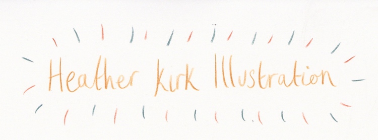
I thought this was rather quaint and welcoming and had a slight charm to it, however when I uploaded it to my website, the paper wasn’t white and clean enough for it to sit comfortably on my page, and I didn’t know what to do to clean it off without having photoshop. So this is another thing to speak to Dan P about in the next round of tutorials. After all that hassle I just went back to the most successful one, which is the yellow one beneath the red title. Here’s a screenshot of the start of my website, and the link to follow. I’m happy with how it is all coming together. I have changed the font of all the titles, and also when the cursor hovers over the page links (see ‘contacts’ below) the colour changes to blue. Just to make it all a little bit more fun!
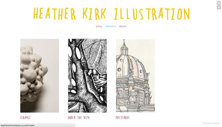
screen shot

Screen shot

Heather Kirk Illustration

A tutorial with Dan Peterson 2-2-16

Well it’s here, its passed and i’m glad. Yes, I’m talking about that dissertation!!!

I had my dissertation finished and printed by Wednesday the 28th, however I didn’t hand it in until yesterday, the 1st Feb. But I already feel great. So today I signed myself up for a tutorial with Dan Peterson, and it was fantastic! I don’t think it could have gone better, and to be quite frank, I don’t think I could have handled it if it went badly!

I was nice and prepared for the tutorial, with my main talking point to be focussing on my website I have developed over the past few weeks and the work that I will be showing on there. I made it very clear to him that there is very little work from my first 2 years here that I would actually be happy to put on there. Not because I dislike it (well, some of it) but mostly because my way of working has developed so much in these past months that I wouldn’t want to be working in the same ways that I have been doing in the previous years. This refers to mostly sticking to watercolours and not giving myself the room and freedom to do what I actually wanted to do, which is make things! I wouldn’t want to advertise work on my website that I wouldn’t be willing to reproduce. And Dan was totally on board with all of this.

I found it really refreshing to talk to Dan about the work I am currently making, for two reasons. 1) it was good to start talking about my work again after a long while of writing dissertations and almost neglecting my project work, and 2) it was lovely to speak to Dan about it, who is a different person to Amelia and Martyn (A fresh face), so it installed the excitement back in me. After explaining all about my work and my materials and my intentions, I was asked some important questions (That have been asked before). These included questions about context, place and why? After a while I began explaining idea’s I had for my work, and we began to imagine it in an advert and photographs, experimenting with different locations and places that my work may be found. This was really helping because these are the questions I had been asked before the christmas break and struggled rather hard to answer.

After talking about my work we went back to my website and I noted down some changed Dan suggested I make, and we spoke of ways to photograph my work and what makes a successful photograph. All in all it was a very uplifting day, and it feels good to be back on track.


2: Dan Peterson

In our second professional practice, the focus was on jobs and going to interviews. WE spoke of the best means of contact for the employer to reach us with, and that if we are emailed, to email back as soon as we can, even if that is just saying that we will get back to them later on. It’s also a good idea to set up a signature on your email that automatically appears when you send an email. When it comes to accepting a job and listening to thier brief, we have to be very switched on when it comes to asking certain questions about the job in hand. For example, what’s it for? the budget? what is it? the deadline? and so on. We were told with a solid no, to not ever do pitches.

After some good chatting about what kind of things to expect when we go to and interview and what they expect from us, we went on to pricing and being paid as an illustrator. We spoke a lot about commissions, where the work will go, how they will use it, territory, if they will want to re-use it, our rights (and never to sign them all away), fixed prices. We spoke of the client- who are we dealing with here? are they high profile? middle class? a high profile business? We really need to be aware of who we are dealing with when it comes to accepting a job.

1: Dan Peterson

We have started professional practice with Dan now, which happens every Tuesday. I found the first session really helpful and pretty good fun. Equally as scary as it is all about getting us prepared for the big wide world, but lets not dwell on that just yet. So in this session we started off b watching a video from a company that explained all of the different area’s you can go into with in the art industry, there are so many jobs out there that I wasn’t aware of! So that was extremely insightful. The day was split into 2 sessions, one in the morning and then the afternoon, both lasting 40 minutes. The first session we talked about portfolios and what we are expected to take with us, speak about, present ourselves etc.

Smaller portfolios are better full of prints or photo’s of your work, rather that bring a huge case with you and trying to fit it on the table. Also, by having prints of your work this means you can leave something with them if they particularly like something of yours. This is pretty handy because then they have something of you, and they will be more likely to remember you this way (stand out from the crowd). It’s also good to have business cards and leaflets to hand out also. Name and information and so on on the opening page of the portfolio, with a strong piece of artwork as an icebreaker. Sort of put your portfolio into sections, if there are certain pieces of work that flow well into others, order it in that way and be clever and neat about ordering. Only include images of your work that you have enjoyed doing and would be happy to work in that way again. If you put something in that you son’t want to repeat and they ask you to work in that way, you’ll then have a problem. Have your certificates with you also, they might ask to see these. These second part of the day consisted of talking about our websites. We spoke about the AOI for a while, and Dan talked us through what makes a good website, what works and what is appealing to a potential buyers.

Next steps are to get some images for your portfolio together and begin making your website.